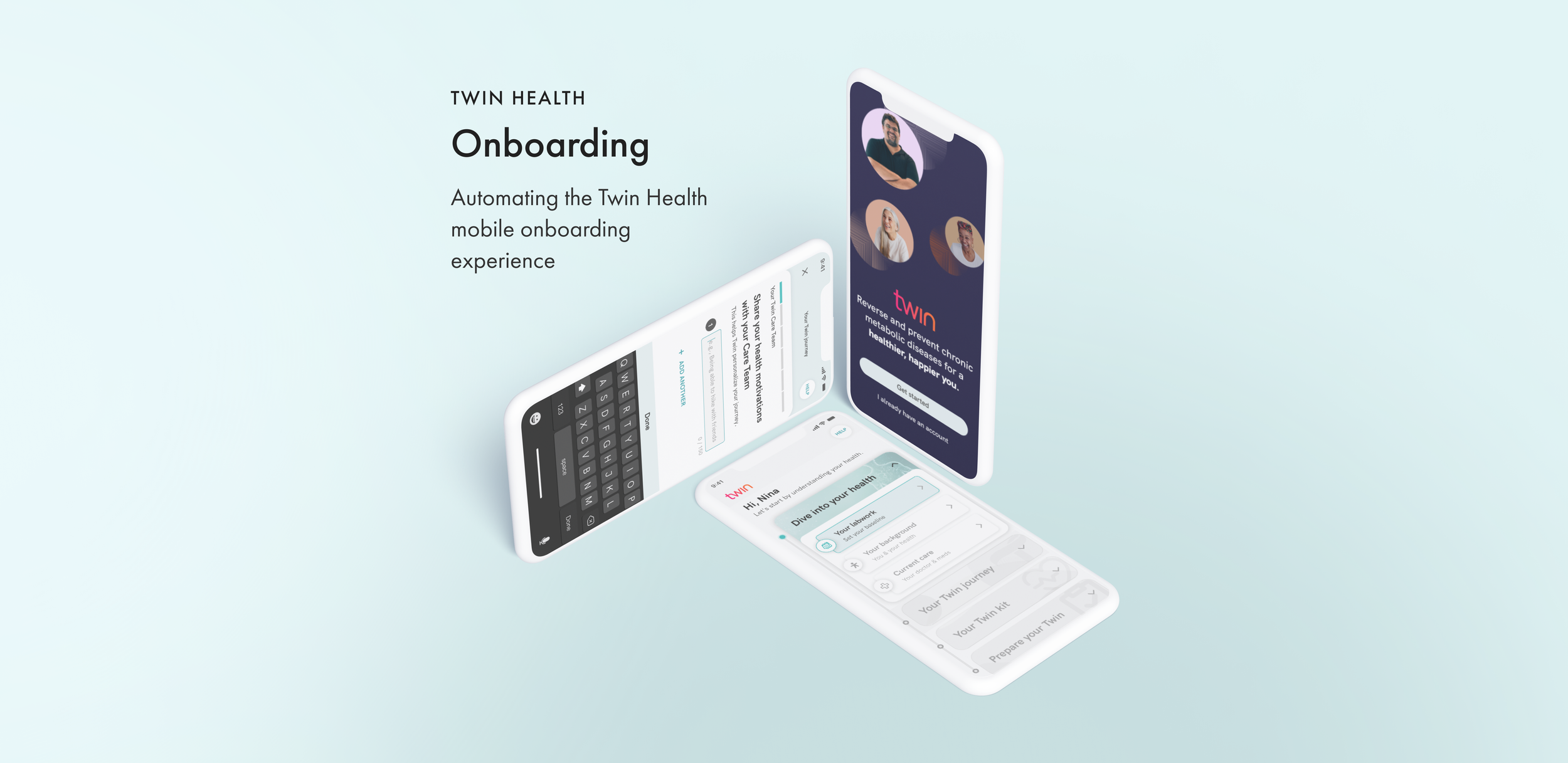

overview
I designed a mobile onboarding experience for both U.S. and India users at Twin Health that automated the onboarding process and improved efficiency for coaches and clinical operations at Twin Health.
timeline
June 2021 - Feb 2022
my team
US & India PM | India Designer | UX Writer | iOS & Android Engineers |
Clinical & Marketing Stakeholders
my role
Lead product designer
Tools

Background
Twin Health is a precision health platform that combines IOT technology and ML to improve metabolic health and reverse chronic diseases. Members are equipped with wearable health technology to build a dynamic digitalization of their unique metabolism.
Members receive daily guidance from their digital Twin, and as their metabolism heals, their Twin continues to learn — allowing them to introduce new foods and activities. These daily insights help members sustain a healthy life, personalized to them.

The Problem
Currently, only 12% of users are completing the entire onboarding process. Only 15% are answering all of the questions.
The current onboarding experience is a long, manual process that has very little transparency to the user, which is causing early dropoff. In addition, it is placing a lot of strain on the Twin staff, who are manually handling every single task.
How Might We
HMW design an engaging and efficient onboarding experience within the Twin member mobile app that increases user completion and automates onboarding tasks to increase efficiencies for coaches and clinical operations?
Design Process


User Research Insights
Prefer a personalized experience
Because the process of onboarding at Twin is inheritantly long, many found that having a human to guide them during the process was helpful.
Sensor activation is confusing and lengthy
Members are required to set up and sync up to 5 different sensors during onboarding in order to set up their digital Twin. Some sensors, such as the Dexcom CGM require multiple, complex steps to set up.
The current onboarding process is too long
The current onboarding time for a typical member is 3-6 weeks. This is due to several factors- some within Twin’s control and some that are not.
The process needs more transparency
Because the current onboarding process has many steps (many of which also take a long period of time to complete), members felt frustrated when they were left waiting in limbo without much information / guidance.
Competitive Analysis Insights

Transparency & Progress
Show where the user is at in the onboarding process at the time.
The Why
Explain why a task needs to be done
and a question needs to be answered.
Simple & Concise
Tasks and questions should
be simple and to the point.
The Current Experience
Twin staff managed onboarding tasks in both the US and India, primarily through the member's Twin Care Team. However, due to differences in healthcare systems, careful consideration was necessary to address nuances and discrepancies between the two.
Future User Flow
I collaborated with the US & India PMs, UX writer, and various teams to create an improved onboarding flow that considered user pain points, operational constraints, and upcoming changes. This involved numerous stakeholder meetings, iterations, and late nights.

Wireframes
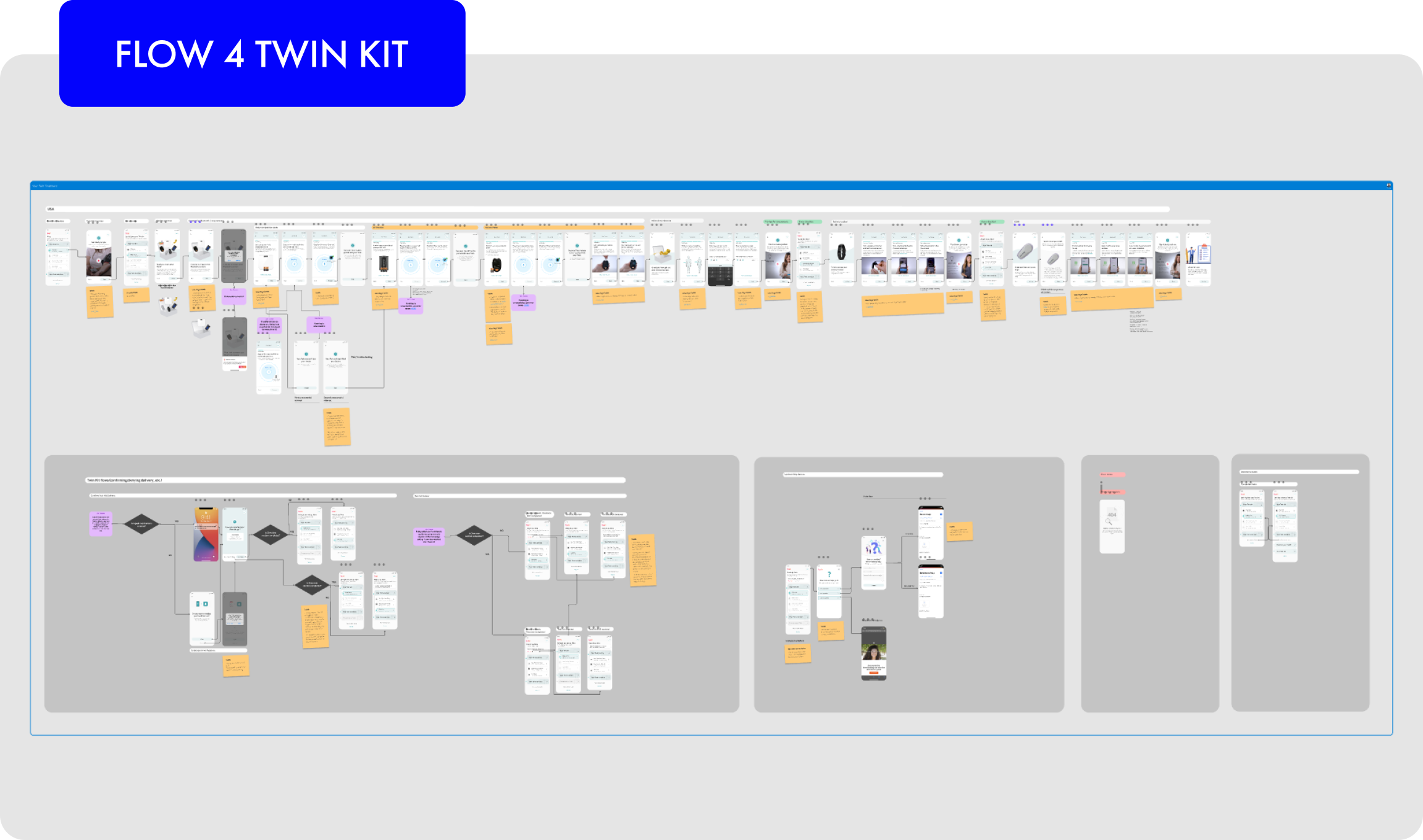
Because Twin onboarding inherently requires the user to answer several questions and perform key tasks we divided the design into 4 flows, which addressed sign up, answering eligibility questions, obtaining health information, and setting up the individual’s health sensors. For NDA purposes, I’ve shown wireframes for the first 2 flows, which deal with sign up and answering eligibility questions.

User testing
Through Usertesting.com, I tested out flows with new users with a demographic that matched our current user base. I tested out UI direction, interaction design, and flows. I also directly interviewed current Twin members [both US and India] as well as Twin Coaches to get their input on the content and usability of the flows.

Hi-fi designs & detailed specs
I created high fidelity designs based off of the wireframes that I created as a base, working with my product manager, our UX writer, and the clinical team to create easy to understand, personable, and succinct messages for each screen.
meaningful detailed specifications in Figma for both iOS and Android engineers to develop the designs. I held design reviews so that I could answer any questions and clarify further details in collaboration with both my PMs and the engineers.


Prototype
I created a prototype of the final design for engineering to better visualize that experience. For NDA purposes, I’ve only included the first two sections below. To interact with the prototype, please click HERE.

Outcomes (as of Feb 2022)
Flow 1: Sign up has been successfully implemented and has already increased new user acquisition by 28% and reduced time to confirm eligibility by 41%.
At the time of me leaving Twin, Flows 2-4 were currently being built and/or tested and QAed internally. These flows will be released cohort by cohort.
Designs allowed us to scale from 200 to 600 members
Implemented Flows 1 + 2 had high completion rates