Re-designing Noom’s psychology-based weight loss app.

OVERVIEW
This project was a re-design exercise for an interview with Airbnb. The challenge was to identify a meaningful problem within any existing digital mobile product and then reimagine and re-design a solution.
ROLE
Product Designer / Interviewee
year / timeline
2020 - 5 days
What is Noom—
Noom is a weight loss app designed by behavioral psychologists. Its mission is to “help people everywhere lead healthier lives through behavior change.” Noom helps people lose weight for the long run and focuses on making tangible, sustainable lifestyle shifts rather than encouraging extreme styles of eating.
The app, which costs a minimum of $45 per month, allows you to…
Generate a personalized calorie breakdown based on a series of lifestyle questions, and track the foods you eat by searching a database of scanning barcodes
Log exercise, weight, blood pressure, and blood sugar
Receive in-app 1:1 health coaching during business hours and stay motivated with interactive articles and quizzes
Why did i choose Noom?
I’d been using Noom for about a week, and although I loved the concept,
I had some usability issues that I encountered and wanted to tackle.On a broader note: according to the CDC, more than 1/3 of American adults are obese. Commercial weight-loss programs totaled ~$3 billion in 2017. Many dieters give up long before reaching their goal. Noom, however, tackles weight loss with a proven, psychology-based approach that identifies triggers, changes habits, and provides a long term, lasting weight loss solution. In 2019 it was one of the most Googled diets, with over 45 million users. In a study of 36,000 users, 80% reported weight lost and 60% of users maintained weight loss.
Noom’s Current State—
Home Screen & meals
Simple design with cards and vertical scrolling
View daily calories and scroll back to
previous days to see daily informationAdd steps, meals, exercise, and access
daily articles, quizzes, and to-dosUser complaint: difficult to view daily
meal overview and add food to meals

Adding Food
Find “Log Your Meals” on home screen amongst
list of to-dos, click on meal, search for food,
scan a food’s barcode, or find an already
created dish, and then hit “done” to finishUser complaint: no ability to view colors associated
with the foods without having to add each food;
no ability to edit dishes

food units
To input food, choose between “easy units” or “more”
Easy units are quick units to add catered towards food items
User complaint: units not always catered well
Accessing “more” brings you to a sliding ruler that
allows you to toggle between different unitsUser complaint: difficulty switching between different
units because numbers on the ruler self adjust

exercise & health
To add an exercise, users must go to the home screen,
find “Do More” (also features option to weigh in, find
Noom recipes, take blood pleasure, and blood glucose),
and then select from a short list of curated exercisesUser complaint: no search option, limited list of exercise options, and lists inaccurate calories burned for many exercises


Design Process
01 problem identification
User Research
Competitive Analysis
Affinity Diagramming
02 ideation
Persona Creation
Design Principles
User Flow
03 Creation
Sketches/Wireframes
UI Design
Interactive Prototype
01
Problem Identification—
User Research | Competitive Analysis | Affinity Diagramming
// User Research —
Methods
Survey: Created a survey and posted it onto the
Noom Reddit page; gathered 53 responsesOnline Feedback: Looked at Apple App Store and TrustPilot comments with constructive feedback (4 stars and below)
Interviews: Interviewed a current user (friend who
uses the app) to gather more in-depth responsesPersonal User Testing: Downloaded the app and began
a 14-day free trial of the Noom Healthy Weight Program
Research Synthesis
Major Pain Points
“Great philosophy, bad UX”
Inefficient and inaccurate food tracking
Limited and inaccurate food database
Limited and inaccurate exercise tracking
Lack of customizability
Coaching is lacking
Groups feel out of sync
Lack of Android functions
No desktop version
Noom’s Differentiating Features
Great articles and quizzes
Good focus on accountability
Based in psychology
Informative and motivating
Sense of community/support
//Competitive Analysis —
Methods
Survey: The Google forms survey that I created included
two questions regarding competitive analysis:1. “Have you used any other weight loss apps?
If yes, what were they?”2. “If you’ve used other apps, how does Noom compare?”
Secondary Research: I conducted secondary research around competing apps and the pros and cons of using Noom vs. these competitor apps
User Testing: I downloaded and tested out MyFitnessPal, LoseIt!, FitBit, Google Health, LifeSum, and 8Fit
Analysis
Noom
Focuses on habit change and long term
sustainable weight loss, more informative
and educational, and more supportive.
Competitors
Have better UI and UX, food tracking
systems, food data bases, and better
functionality, efficiency, and accuracy.
//Affinity diagramming —
I listed all of the features, grouped them, and used a priority matrix to sort them by level of importance. I then did a round of user testing to see what users actually felt was important (indicated by blue dots).

02
Ideation —
Persona Creation | Design Principles | User Flow
//Persona —

//Design Principles —
01
Reliable & Trustworthy
Accuracy and dependability are pertinent to engaging users in long-term use. Ensure that all data, inputs, and outputs are accurate and dependable.
03
Easy-to-use and Comprehensive
Ensure that the experience is seamless, efficient, and thorough.
02
Customizable
Have the ability to intengrate into different lifestyle choices and health goals.
04
Delightful and Fun
Bring joy into an activity that is usually tedious
+ boring
//User Flow —

03
Creation
Sketches/ Wireframes | UI | Interactive Prototype
//Sketches —

Home Screen Features:
Overall weight progress & ability to look at progress and info from various perspectives
Menu bar at bottom to access saved articles, recipes, messages, and home screen
Hamburger bar at top left for secondary info
Ability to toggle between food, exercise, and daily to-dos, enabling user to have a clear view of and access to information

Tracking Food:
Adding food features a split screen that includes favorite foods, saved meals, and recipes on the top half and access to recently added foods on the bottom half
View color breakdown of a food, meal, and recipe easily without having to add the food
Users are also able to add foods by scanning food’s barcode

Food and Exercise Profile
Food and exercise profiles allow user to favorite, add, and view more detailed information; ability to build workouts
User can choose from a wide range of units and has ability to manually add in an amount or add a fraction for easy and quick input
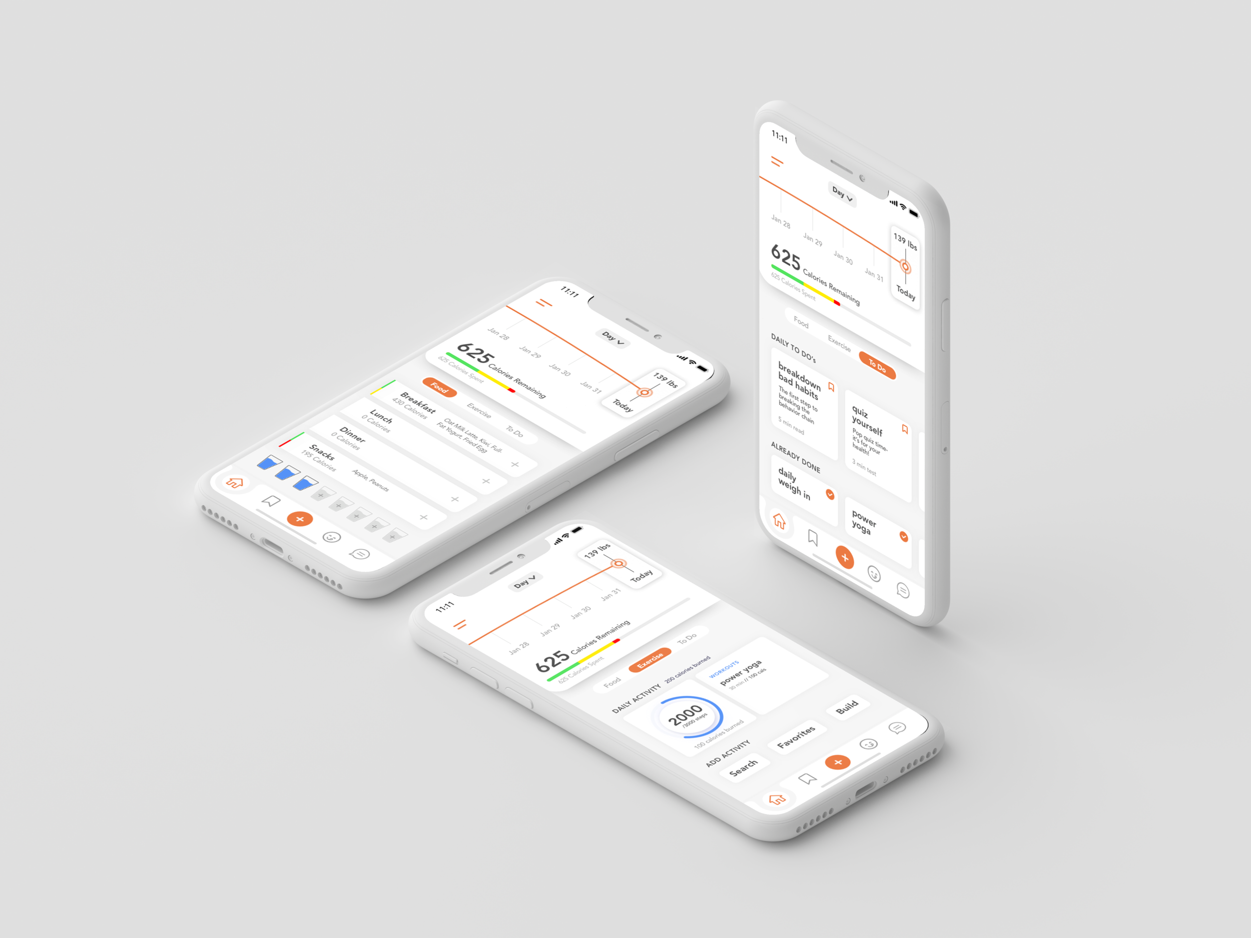
//Final design—

Key Features
The re-design allows users to easily access and view
food and exercise tracking as well as daily to-dosUsers can view weight and calorie progress as
well as dig into information from previous daysOther features include water tracking, journalling,
and the ability to easily access articles and recipesUsers can search, favorite, or build exercises
Users can easily and efficiently add, edit, and
give feedback on foods, meals, and recipes
Foods, meals, and recipes are color coded so users
can make decisions before having to add them inFood profiles gives users the ability to add foods with the correct measurements easily, favorite the item, and dig into more nutritional information such as macronutrient breakdown
Conclusions & Reflections—
Feedback
I posted the interactive prototype I created in Invision onto Reddit and got a ton of good feedback:
The positives…
“This is great! It would make navigation of the app so much more
userfriendly. I have actually held off on recommending this program
to several folks due to the app layout. The program has been
great for me so far, but the app is a miserable experience.”“I like what OP has done with the food logging UX,
which is the most frustrating for me right now.”“This is fantastic. I love it! I’ve enjoyed the Noom program
so far, but honestly the app is 80% of the reason I
probably won’t renew when my subscription is up.”“I love the ability to switch between meals while in
the food log. That’s one of my biggest pet peeves.”
The negatives…
A few users who disliked how prominent
the weight graph was in the redesign due
to a focus on the weight, which could be
de-motivating for some (although some
people liked seeing progress).A user who felt the home screen was too cluttered and also felt that the to-dos and reading material should be front loaded
on the home screen. I do think that finding
a way to front load the to-dos would be worthwhile to explore.
Lessons Learned
The top two lessons I learned was to plan well and
to get constant feedback and input from users.
5 days go by quickly (especially when you have other responsibilities to tend to), so creating a good plan will set
you up for success and prevent you from scrambling at the end.Introducing user feedback and input throughout the process was key to ensure correct problem identification, feature prioritization, and creating a design that not only resolved
user issues, but also embodied characteristics that
delighted them and exceeded expectations.
Future Considerations
If I had more time I would definitely incorporate the feedback from the Noom subreddit to improve the experience further.
I’d also build out: the article section (would feature the ability to easily access articles and filter articles by date, topic, or saved articles), the build exercise section (would give users the ability to build custom workouts), and the Noom recipe section.
I’d also want to build out a desktop version & accommodate Android users as well as as partner with more robust and established food and fitness databases for a wider scope of more accurate and reliable information.
Ideas, insights, and designs are property of Kaycee Xiao. Do not distribute or reproduce without express permission from Kaycee Xiao.